

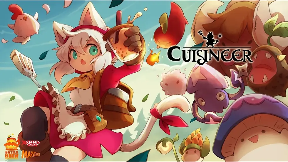
Cuisineer
INVENTORY SYSTEMS
Overview
Cuisineer is a super cute and tasty roguelite-flavoured dungeon crawler, where players have to juggle between running a restaurant and dungeon-diving for fresh ingredients to be served.
In this project, I was tasked with designing the player’s inventory systems, namely the bag, belt, fridge, chest, and customization storage. This is a case study of how these different inventories were designed, the challenges faced, and the solutions found.
Note: The UX in this system were designed primarily for keyboard and mouse, so I will only be focusing on those modes of control.
In Cuisineer, the player can collect a variety of items such as dishes, equipment, ingredients, and potions. These items all had their own unique traits. For example, dishes and ingredients can only be stored in the fridge so they do not go bad, while equipment can only be stored in chests.
Design process
Before starting to ideate any of the inventory systems, I first had to consider what information the player should be seeing at which point of the game. This led to me designing how the HUD could potentially look like first, and what information should be displayed to the player.
After some research into similar games, I decided that the HUD should have these elements with regards to showing the player’s inventory:
-
Belt bar to show the player's currently equipped weapons and bubble teas (potions)
-
Coins to show the total amount of money the player currently has
-
Bag slots to show the number of occupied bag slots relative to the total number of bag slots
These will always be displayed to the player as they are important information that the player needs to know at any given point of time. The final mockup is as shown:

Now it was time to start designing the inventories themselves, starting with the player’s bag.
BAG
The bag is something that the player carries with them at all times and will contain items that the player picks up from dungeons or buys from shops in the town. It consists of the bag slots, where items are contained, the player’s equipped gear, and the belt slots, which is synonymous with what appears on the HUD.
While designing, there were some considerations I had to make.
item types
The player can pick up a variety of items, so there needed to be some way to show the player what category an item belongs to.
To display this, I decided to have a tooltip that appears when the player hovers over the item in the inventory which will show the item’s name, type, and description.

To make it easier for the player to know how many of the item they currently have, I also added numbers that reflect the current number of that item the player has in their bag or storage.
stacking items
Next, I had to decide what items can and cannot stack, as well as the maximum limit an item can stack for. In order to determine this, I looked at the traits of each unique item type, and separated them into those which can stack easily, and those which cannot.
For example, it is easy to stack ingredient types as they are fixed and will not be changed.
An egg will always be an egg, and a chili will always be a chili. However, an egg is not a chili, so eggs cannot be stacked with chilis, and vice versa.
This resulted in something like this, where eggs and chili would go into separate slots, but multiples of the same ingredient could be stacked.

Using that logic, wood can be stacked together, but wood cannot be stacked with ingredients, or other materials that are not wood.
Ingredients and materials are easily stackable, but that isn’t the case for equipment.
In Cuisineer, the player can procure equipment that have different modifiers attached to them. This makes it more possible for the player to get different modifiers on the same equipment, so stacking equipment wouldn’t make much sense. As such, equipment are not stackable and occupy 1 slot each.
equipping equipment
Since the player could pick up and buy equipment, there needed to be a way to equip them.
As such, the inventory system also had to account for the type of equipment the player currently has equipped, in addition to any equipment they may have in their bag slots.
To facilitate this, a section of the inventory is dedicated to the player’s currently equipped gear, and shows the equipment’s name, type, attack value, and modifiers (if any).
Like the items in the bag slots, a tooltip would also appear if the player were to hover over the equipment. However, to help the player decide better which equipment they want to equip, the currently equipped equipment will also be shown as a comparison.


general controls
The inventory system is of no use if there is no way for the player to control what they are selecting. As such, I had to design possible controls and key bindings that the player could use to equip equipment, or move items around in their bag. A sample of the first control scheme is as shown:

discarding items
The bag doesn’t have unlimited space, so there needs to be a way for the player to discard their items.

To do this, the player just has to drag an item over to the trash bin icon to discard it.
To prevent the player from discarding their precious equipment in the final game, there is also a confirmation pop-up that appears whenever the player attempts to discard any upgraded equipment or equipment with 2 modifiers on it.
bag upgrades
Lastly, I had to design how many slots the player should start with, and how many bag slots they can get if they upgrade their bag.
To that end, I also had to figure out a way to show the player what slots are currently available and what are not, in a manner that allows the player to know that their bag can still be upgraded, but not be confused as to why some slots are not usable.
The final mockups after taking everything above into consideration are as shown:

BELT
Like the bag, the belt is also something the player has access to at all times.

Unlike the bag slots, the belt can only handle specific item types. It consists of the primary and secondary weapon slots, as well as the bubble tea slots.
In the HUD, this belt essentially functions as a hotbar for the player to quickly view what weapons they have currently equipped and what potions they can use. As such, I had to design hotkeys to show how the player could actually use these potions.
The major challenge with designing the belt was mostly that it had to be very consistent in design both on the HUD and in the actual bag UI itself, so I had to come up with an interface that would work in both cases but not seem out of place in either.
For example, I couldn’t have the belt appear horizontal in the HUD, but vertical in the bag UI, as that may confuse players, so I had to work around that restriction. Lastly, the belt also has to be upgraded to unlock its full potential, so I had to design what the belt looks like if there are still unusable slots, which ended up looking something like this:
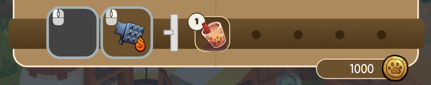
The dark circles simulate belt holes that have not been put to use just yet.
fridge
Unlike the bag and belt, the fridge is a stationary furniture item that the player can have in their restaurant, and more than 1 of it can exist at any time. It follows the design of the bag, but unlike the bag, it could hold more items but only if they were dishes or ingredients.
It is essentially similar to the bag in terms of function, but there were a few improvements I had to make.
transferring items
I needed a way to allow the player to pick and choose what they want to shift from their bag into the fridge, and to do that, I first had to design this system in such a way that the player can see what is in their bag and the fridge at the same time.
As such, it looked something like this:

Any item that could not be stored in the fridge had to be greyed out to prevent players from possibly being confused about what the fridge can store and what it cannot.
general controls
The controls of the fridge system are similar to that of the bag, except that it allows for the player to quickly move items into the fridge.

discarding items
The fridge doesn’t have unlimited space, so there needs to be a way for the player to discard their items. To do this, the player just has to drag an item over to the trash bin icon to discard it.
This can be done either from the bag or fridge slots.
fridge upgrades
Finally, I had to design how many slots each fridge should start with, and also accommodate for more storage space than the bag.
While designing how locked slots should look like, I also added tabs so as to allow the player for up to 2 times the total storage space they would normally get in their bag.
The final mockup is as shown:

CHEST
The chest uses the same system as the fridge, except it only allows materials and equipment to be stored.
This is what it looks like:

The chest also does not have tabs, so they can store less things compared to the fridge. This is to prevent too much hoarding, as the player can only have up to 5 chests in their bedroom.
furniture storage
The player can customise their restaurant with furniture items that they have purchased. Unlike the other inventory systems, the furniture storage system needed for customization was a whole different beast. I faced many challenges while designing this system.
information displayed
This system was not just about keeping track of what furniture items the player has, but also about limiting the player to only have a certain number of fridges and cooking tools in their restaurant at different points of the game.
In total, the information that had to be shown to the player are as listed:
-
Different tabs for each furniture type
-
Control scheme for moving and rotating furniture
-
Control scheme for toggling the UI for screenshotting
-
Control scheme for zooming and panning the camera
-
Total number of furniture items the player has / total storage limit
-
Number of each furniture item the player has and what it looks like
This is a lot of information to be conveying to the player and the space I had to work with wasn’t much, since the customization UI had to be non-intrusive so that the player could see the restaurant while arranging furniture.
furniture tabs
The first task was deciding how many tabs the UI needed, based on the different furniture types. This is how it looked like:

On the left, the total number of cooking tools the player has / limit of cooking tools is shown. The central area is where the player can select the different furniture types to filter by, and on the far right is the number of furniture items the player currently has / total limit.
It seemed fairly simple to understand, so I moved on to designing the bulk of the content.
furniture slots
This bar will show the player the specific furniture they have under each type. The tab selected right now is ‘All’ so furniture items of all types are shown. A preview of what the furniture looks like and the number of that item the player has is also displayed.

In addition to this, there was also a furniture buff system, where placing certain furniture would affect the appearance rates of certain customers.

The control scheme would be listed on the bottom right of the screen, and the player can scroll through their different furniture by using the arrow buttons on the left and right.
research
To assist me in designing inventory systems that would be intuitive and familiar to players, I researched some games, such as Stardew Valley, Moonlighter, and Story of Seasons: Pioneers of Olive Town.
bag
In Moonlighter, the player has a fixed inventory of 20 bag slots, and the bag only contains unequipped equipment and other items.

It is worth noting that all items in the first 5 slots in the bag will be kept even after the player dies, while everything else beneath will be lost upon death.
In this system, different items have different rarities, and different rarities have different stack limits.

For example, the stack limit for rarer items is 5, while more common items can be stacked up to 10.
The inventory system consists of both the items in the player’s bag, as well as the current equipment the player currently has on, which I then used to inform my design for the bag UI in Cuisineer.
I was inspired by Stardew Valley’s cleverly designed inventory UI, complete with tooltips that give more information about items, and a way to discard items.

This was used as a framework for what information to show to the player when they open up their bag, fridge, or chest.
belt
Since the belt had hotkeys for the player to quickly use items or weapon specials, I referenced some MMORPGs to decide on controls that would be both intuitive and familiar to the player. One of the games I referenced was Daiblo 3's hotbar layout.

fridge tabs
The fridge tabs were adapted from Story of Seasons: Pioneers of Olive Town, where the player could upgrade their fridges to have a total of 4 different tabs of 24 slots each.

furniture storage
For customization, I referenced Genshin Impact’s furnishing system and camera controls.
Genshin Impact has different furniture categories, which is separated further into separate tabs. The player can view furniture items, the decoration points they award, and the amount of that item they have.

I adapted this system for Cuisineer, by going straight into the separate furniture tabs instead of having furniture categories that branched into more tabs.
challenges
As with all other design processes, I faced many challenges when designing the inventory systems.
These systems rely heavily on the user interface and require the player to understand many information at once, so it was quite a challenge to decide what information to show to the player at which points in the game, what information to only show if the player searches for it, and what information the player should never need to see.
This was especially so when it came to designing the customization system, as there was a lot of information that needed to be shown to the player, but it was also important not to overload them so some of the information were hidden behind tabs.
After the prototype was done and I could test the systems, it was also found that the controls felt a bit clunky when shifting items from the player’s bag to the chest/fridge. This was solved by implementing a quick transfer feature, which was inspired by Stardew Valley.
The quick transfer feature in Stardew Valley allows for players to quickly sort their items. The only problem with Stardew’s quick transfer was that the player could only transfer item types that already existed in the chest.

The only problem with Stardew’s quick transfer was that the player could only transfer item types that already existed in the chest. For example, if the player did not put coal in the chest, then clicking quick transfer would not move the coal from the player’s bag into the chest, unless there is at least 1 coal in the chest. This choice made sense because the player could decide what goes into each chest, and there wasn’t necessarily a distinction between chest A and chest B.
As I was inspired by this feature, I decided to improve it to suit Cuisineer such that the player could quick transfer any item that fit the requirements for the chest/fridge.
conclusion
Overall, this was a challenging but insightful experience and I was able to learn how to design different inventory systems which use the same base logic, but need to be slightly modified each time to cater to their unique purposes. The skills I have learnt will definitely help me design better systems in the future with more quality-of-life improvements.
Here are a few images of the final systems in the actual game!


If you would like to try Cuisineer out for yourself, do check out this trailer, and visit the Steam page!